
Here is a new logo that I created for my nieces artwork and crafts that she makes. She draws a lot of animals & fantasy creatures so I wanted to represent that in the logo, hence the snake. The shape of the snake also makes in artist palette which really represents most of what she does.
I Got A Guy Handyman Services – Branding
Here is my newest logo and branding for I got a guy handyman services. You can find out more by going to www.facebook.com/I-got-a-guy .
Logo
For the logo, I wanted to incorporate some of the tools that they use on a regular basis to give an idea for what services they provide just by looking at the logo. I included a sawblade and hammer into the O and T of got. And I also included a wrench for the Y.
The colors for the branding are Blue, orange, and black.
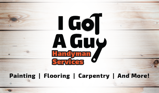
Facebook Cover Photo
I also created a Facebook cover for the Facebook page using the logo. This Facebook cover then inspired me for the design of the business card.

Business Card
As you can see here, the front of the business card is very similar to the cover photo.
As you can see here, the front of the business card is very similar to the cover photo.
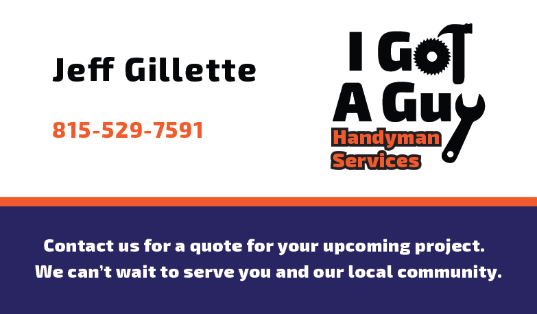
I then also use the bottom of the cover photo on the back of the business card with the same information.
Car Magnet
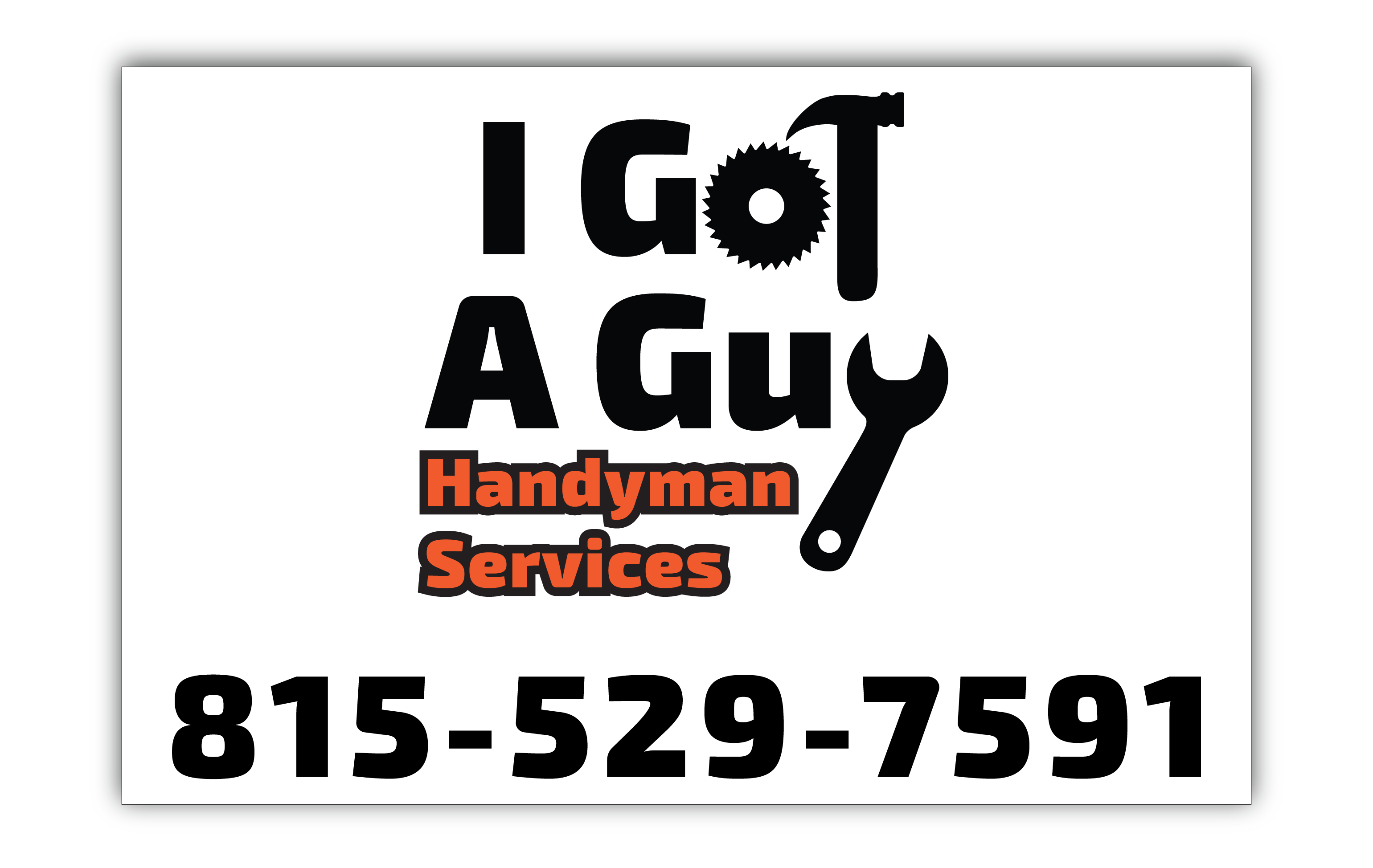
The final thing I created was a car magnet so that they could have the logo and phone number on their car while driving around and also while they were at a job. This will also help to advertise for their business and get more projects.
Chara’s Cakepops and Confections – Logo
Here is my newest logo that I created for Chara’s Cakepops and Confections. Please go and check out their page to learn more about there cakepops and other confections.
This logo was inspired by simplistic circles and curves. It was also inspired by the line work you can find in Art Deco designs. The main goal for this logo was to create something that represents the business and was a simple design.